Helm Group: Strength & Unity Through Strategic Re-Branding
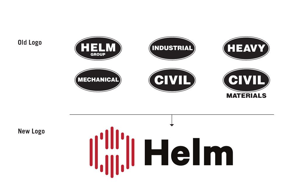
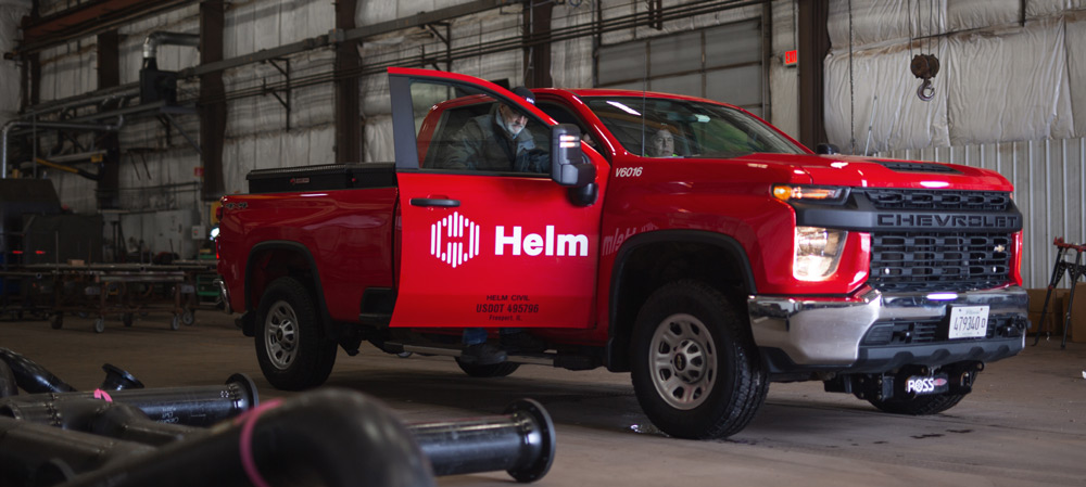
If you live in Northern Illinois or Chicagoland, you’ve seen an ubiquitous fleet of red trucks emblazoned with classic oval-shaped Mechanical and Civil logos. The trucks are owned by a large, established mechanical and civil contractor named Helm Group headquartered in Freeport, Illinois.
When we received a call from Helm leadership in late 2018, they were looking for help with marketing materials and the company website. But, as the early conversations turned to the sprawling group’s communications fundamentals, we jointly realized the timing was right to consider re-naming and re-branding its parent and six sub-brands into a more cohesive, modern and better-integrated corporate identity. The divisions could then more smoothly support each other and feed referral business back and forth – not to mention be more easily found by prospective customers using internet Search technology.

Before putting pen to paper or finger to trackpad in the design phase, we engaged in a deep-dive GSearch process that polled employees from all company divisions, business partners and sub-contractors, client leadership and peers from inside and outside the geographic markets Helm serves.
The research & planning phases not only helped validate the need for the identity consolidation, but:
- produced insightful, impactful positioning options
- generated an updated communications hierarchy
- contributed to an evolving brand language
- informed new logo concepts
- allowed accurate website site-mapping, wire-framing and design
- formed the basis for advertising content
- provided a strategic foundation for audience targeting and media planning
When GSearch was completed, we were confident in our recommendation to consolidate under one brand name and logo and do so in a modern, sophisticated fashion that would help Helm stand apart in the tough Chicago market where it had not only established a foothold, but was flourishing – as well as in other new markets such as Omaha, NE and Lenexa, KS.
SCOPE
OF
WORK
20+
Over 20
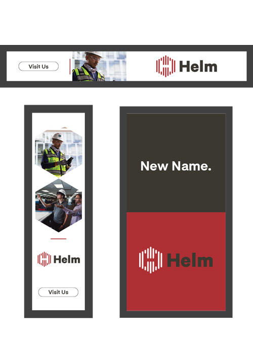
Unique Brand Applications
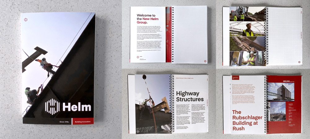
Company vehicles, employee clothing, custom-built signage, print and digital assets
5
Original Videos Supporting Multiple Divisions
3
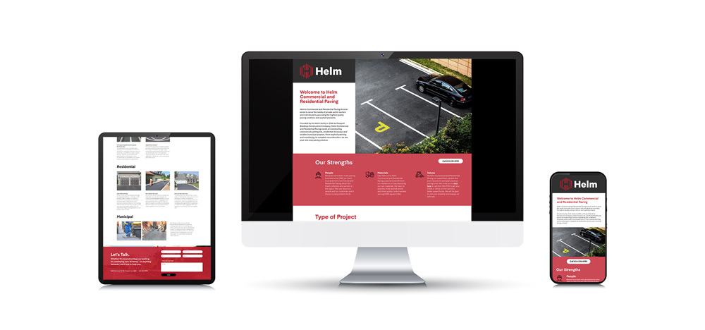
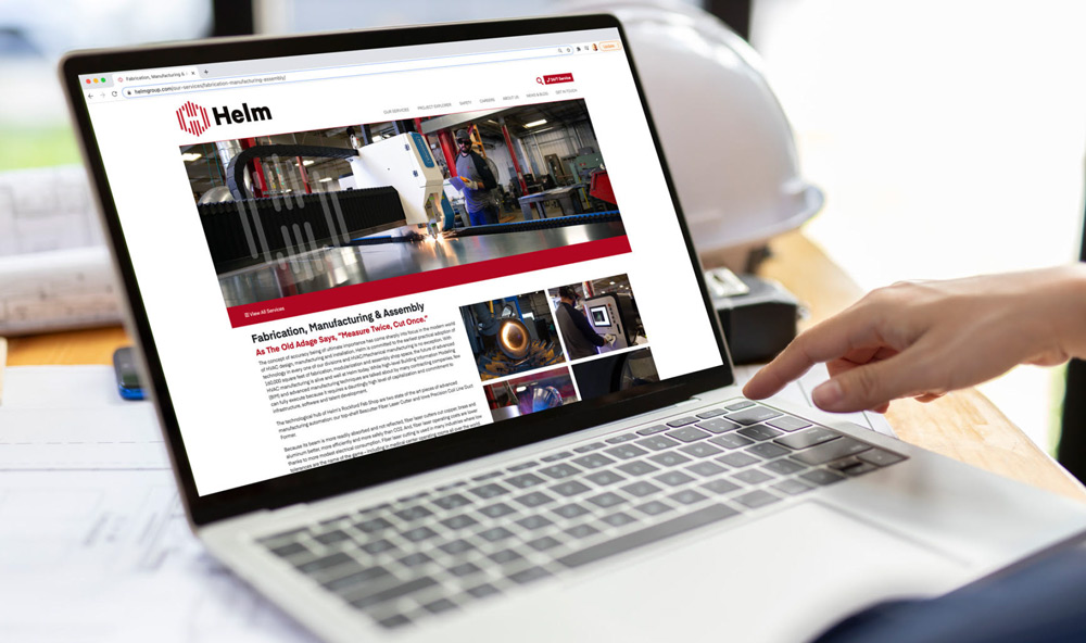
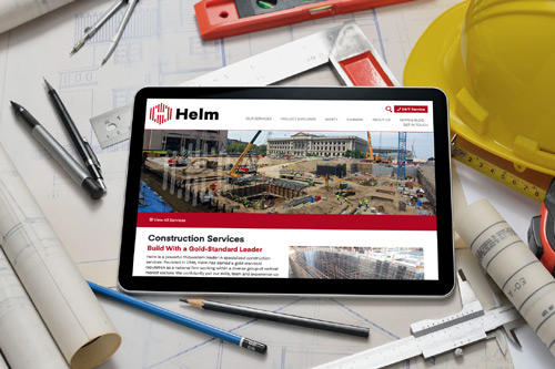
Responsive,
Fully Customized Websites
7
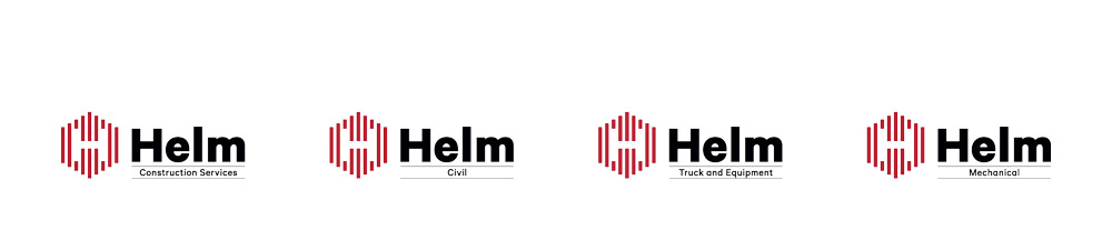
New identity system accommodates parent company and six sub-brands.
Over
100
New Original Feature Photos
To help support digital and printed collateral
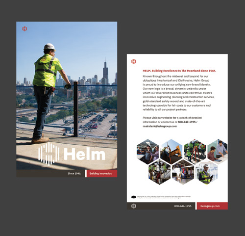
Helm’s existing oval logos were very popular among its tight-knit, family-oriented team, especially the longest-tenured employees. It was important to CEO Brian Helm that the new logo concept be an evolution of the old identity, not a complete departure. GrahamSpencer fulfilled that expectation.
The new logo’s multiple lines represent disparate skills and people coming together in nature’s strongest structure, the hexagon. From beehives to crystalline structures to Ireland’s Giant’s Causeway to the cloud that hovers above the planet Saturn, hexagons are a key element of nature’s own engineering – and engineering is the basis of everything Helm does.
Everything about how Helm communicates is being up-graded, from its website, letterhead and business cards to Powerpoint templates to tradesmen’s helmet stickers and much more. The dynamic new website you can visit here will be a key lead-generation tool. And, as this case study is being written in early 2021, Helm’s first digital advertising campaigns are being tested in select markets.

Helm is a hard-charging, high-tech juggernaut of construction industry expertise and excellence. We at GrahamSpencer could not be prouder nor more appreciative of having been in the position to help build the brand.